Lumos Lantern Festival
#branddesign #logodesign #brandidentity
When the team started forming an Idea around a Lantern festival in an open field that is all about positivity, brightness, togetherness and ofcourse Environmentally-sound, Began our search for the name that suits perfectly, was unforgettable had a positive feel to it. With more than a dozen ideas LUMOS emerged and with that, the torch of a new brand was lit.
The Ideation
When thinking about the brand’s colors, the first thing that comes in your mind is FIRE, a lantern is powered by fire, looks red in the sky, so the obvious choice was to go ahead with a rich shade of orange expressing feelings of excitement, enthusiasm, and warmth. Orange, the color of joy and social gathering. Color of extroverts together with a pinch of red on top expressed the core of fire and love.

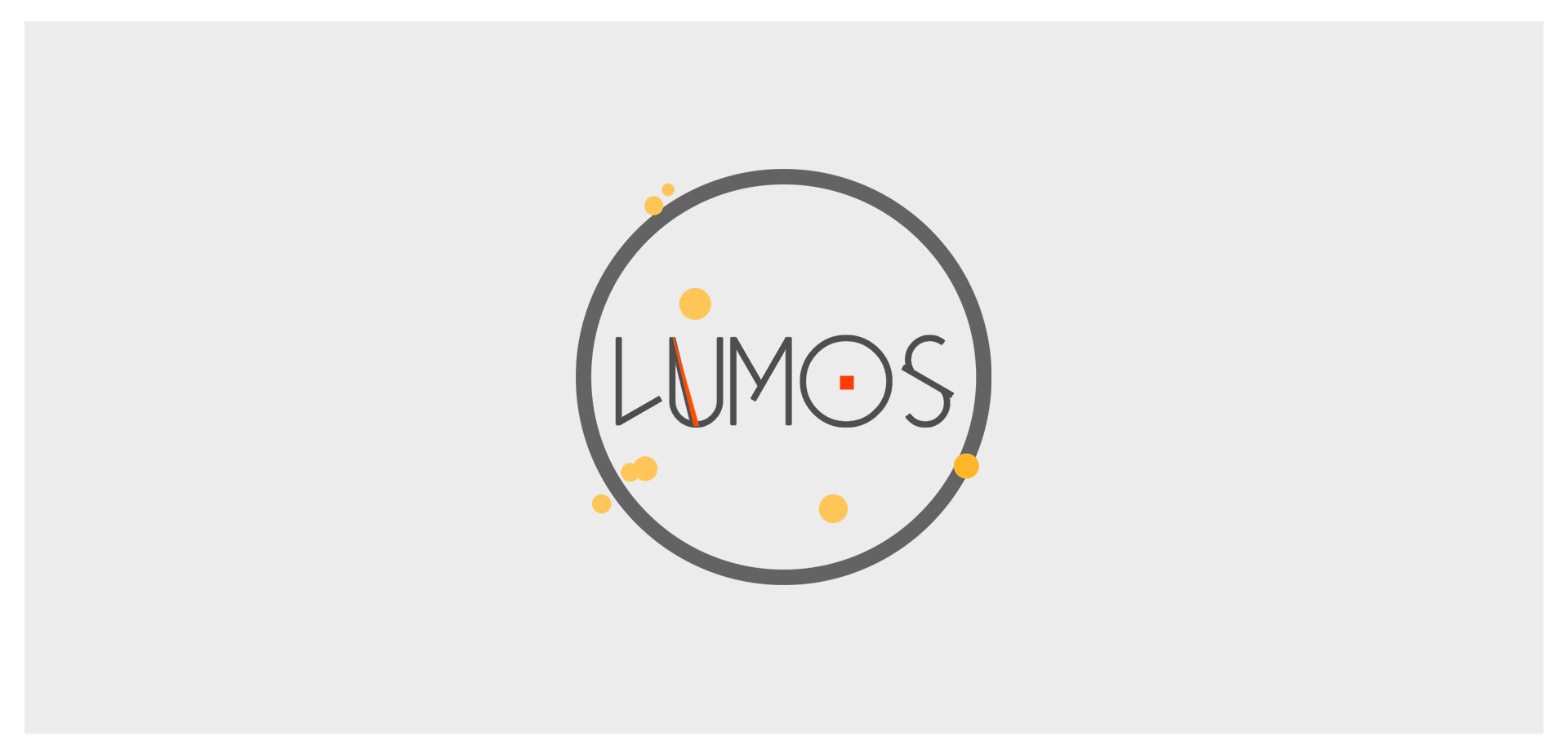
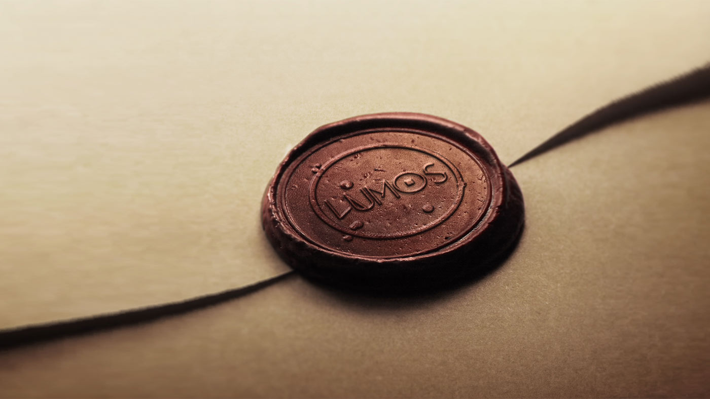
We decided to keep the logo simple, readable and easy to be printed on the festival merch. With logotype and font face lifting off, we started to add up ideas behind the expression. A little rectangular shape inside O expressed the fire and an unusual red line inside ‘U’ expressing the torch itself.

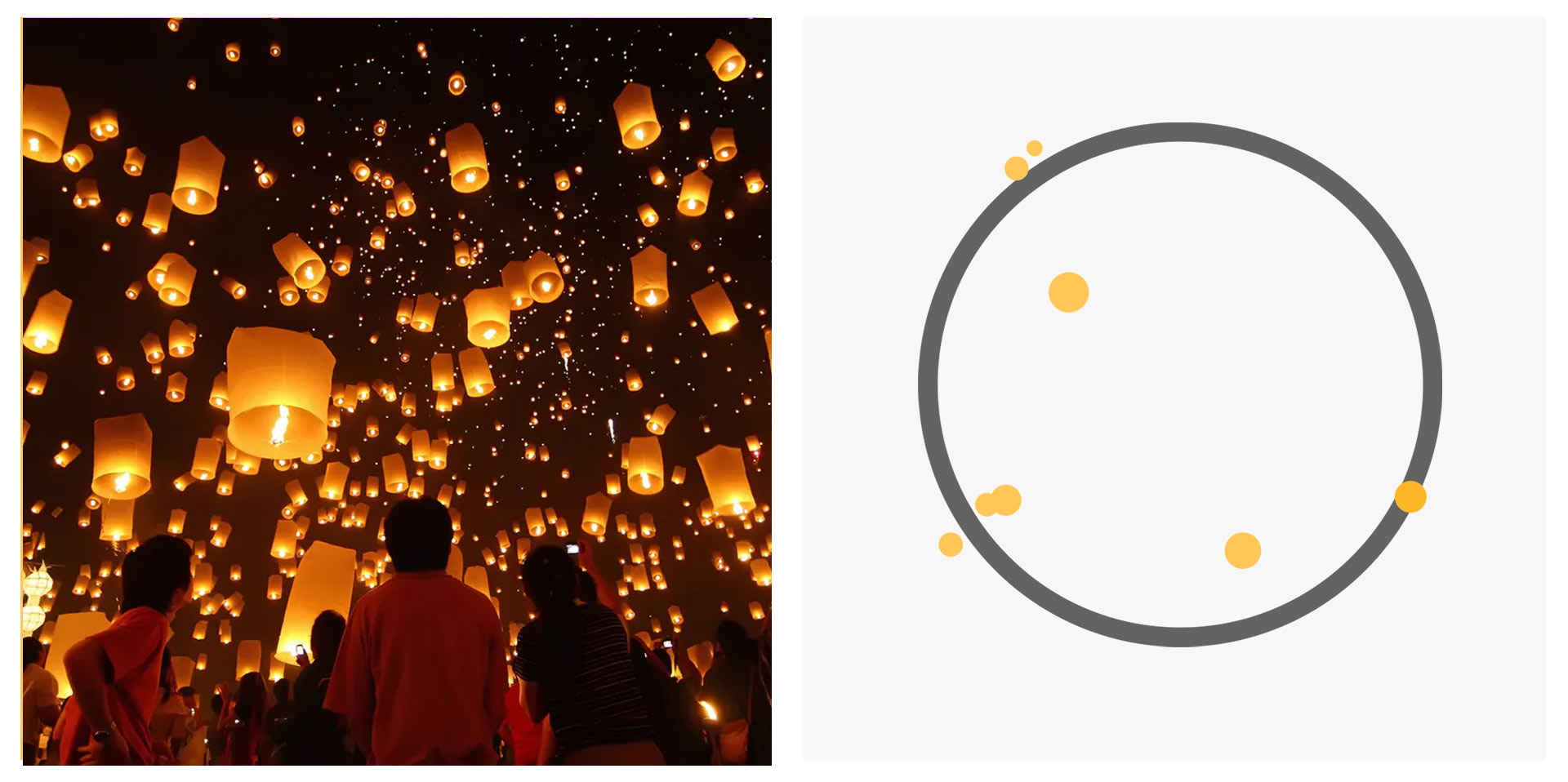
Lantern festival, right? A few boxes and circles floating around in the night sky, with a bunch of people gathered around a huge bonfire! Such a beautiful sight. We had to be it exactly looked and felt like it sounds.
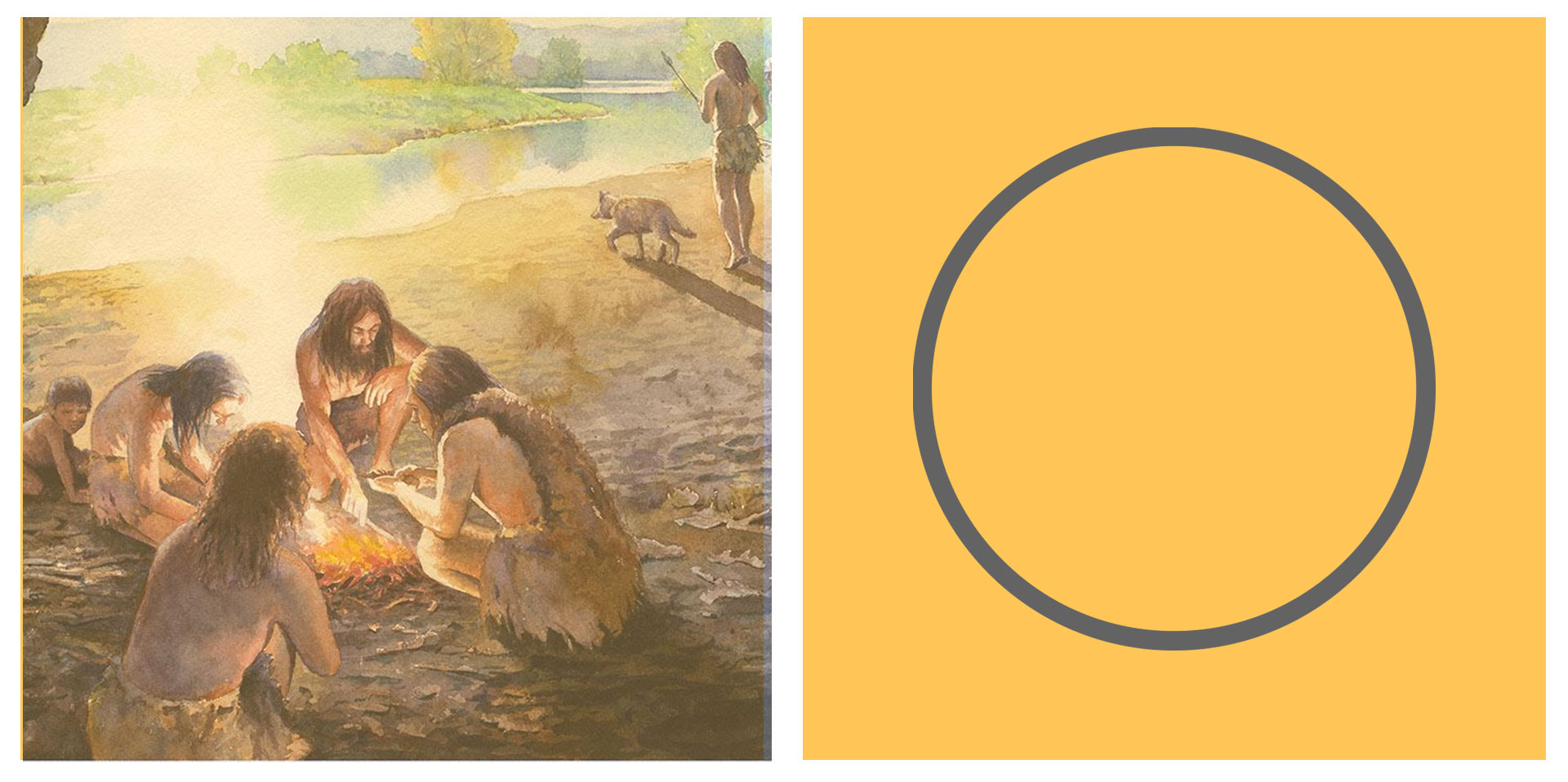
We do sit in circles around the bonfire, don’t we? The first of human gathering that actually brought us together and built an early foundation of civilization. It’s the fire that bonded us, we spoke about our experiences and the ideas to make our lives better, we shared our food with each other, the only currency that we had. We celebrated life gathering around it in a circle dancing and holding hands to our friendships and joy. We found safety! And from gatherer-hunters we settled to become what we are today. A campfire & circle that’s all it took. And thats what LUMOS is all about. Friendships, Joy, Sharing & Evolving.
A lantern festival logo without actual lanterns? Not a chance!!
With all ingredients in the bowls and pans on fire, and the right recipe we presented our own Ratatouille to the client.
With logo looking good we moved on to designing the visual of the event
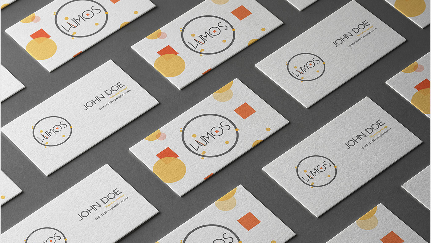
Stationary
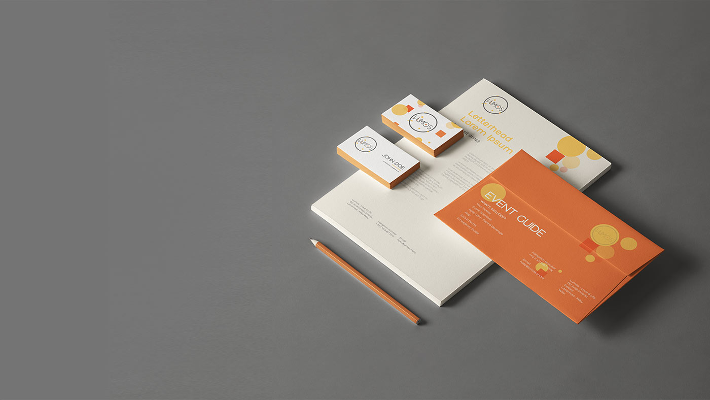
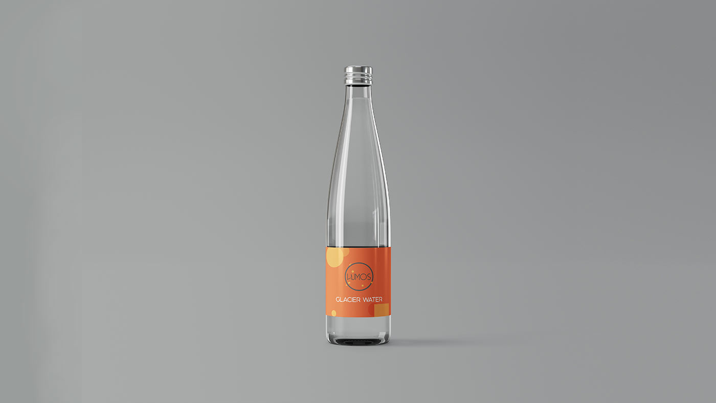
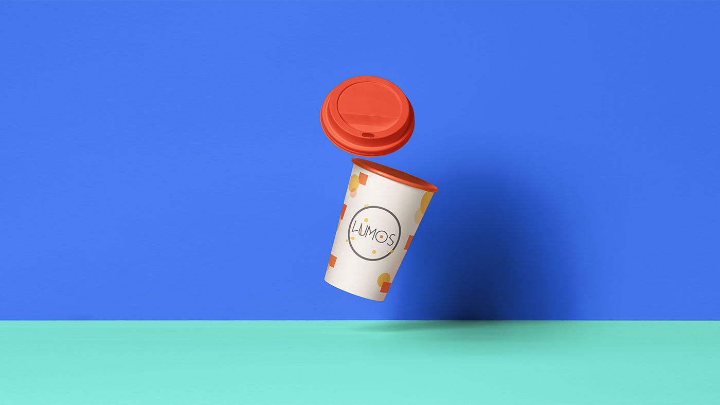
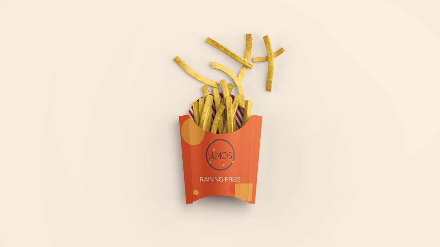
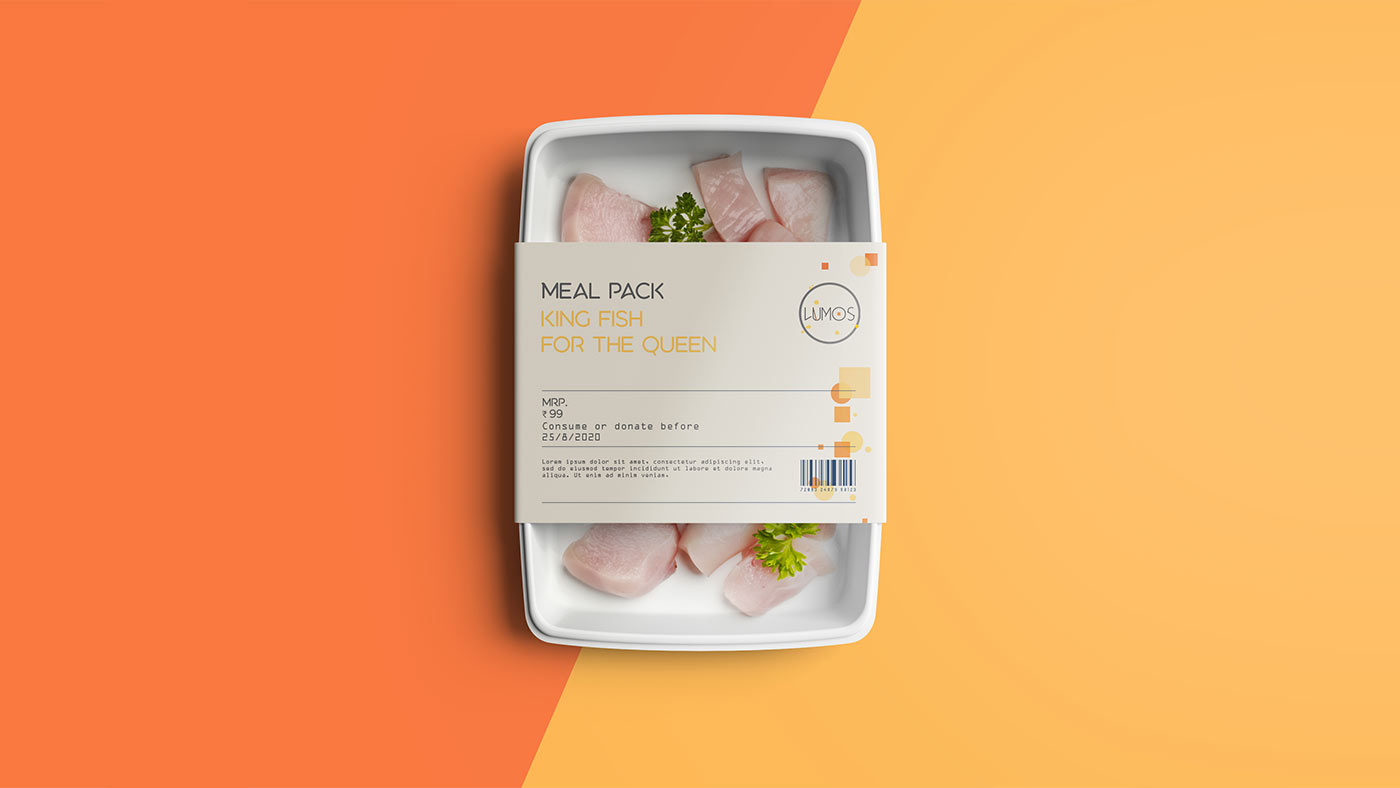
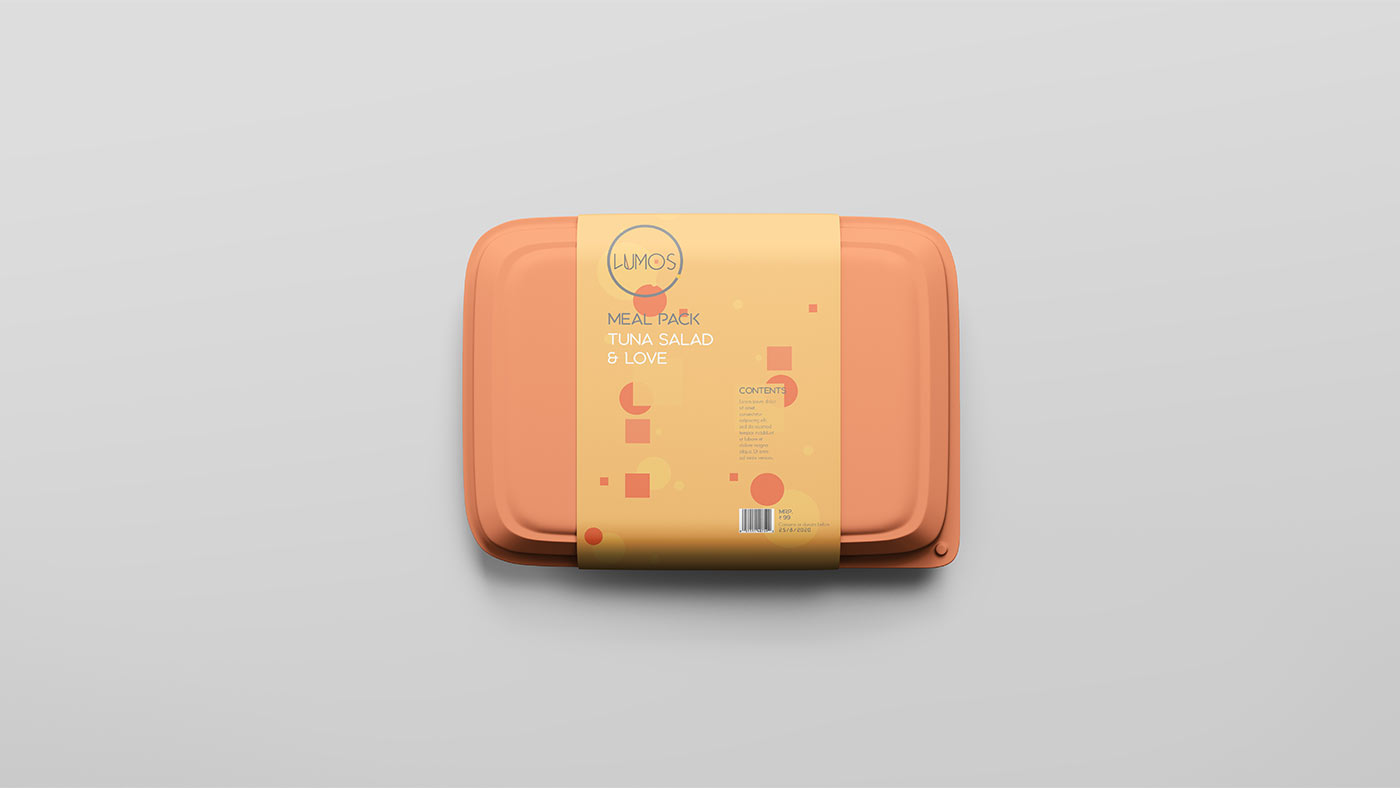
Consumable Products Packaging
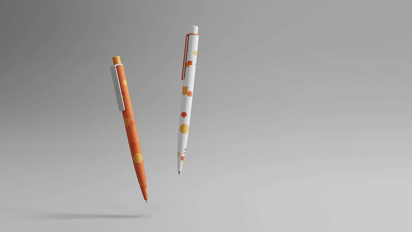
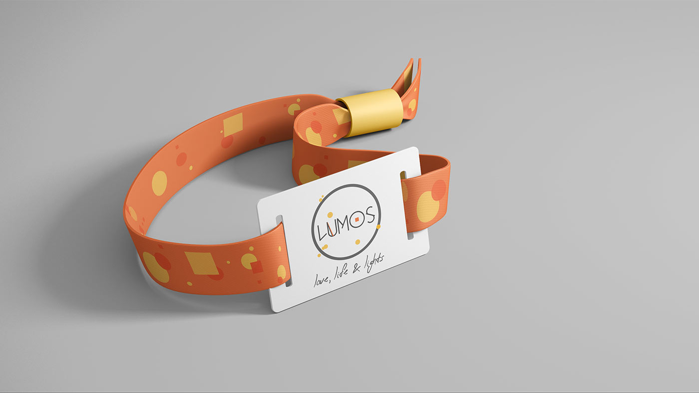
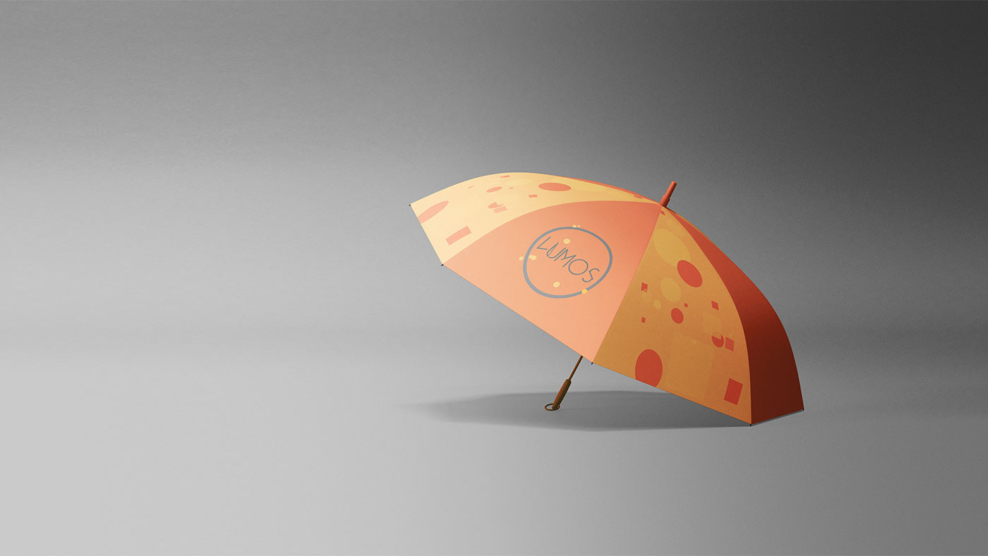
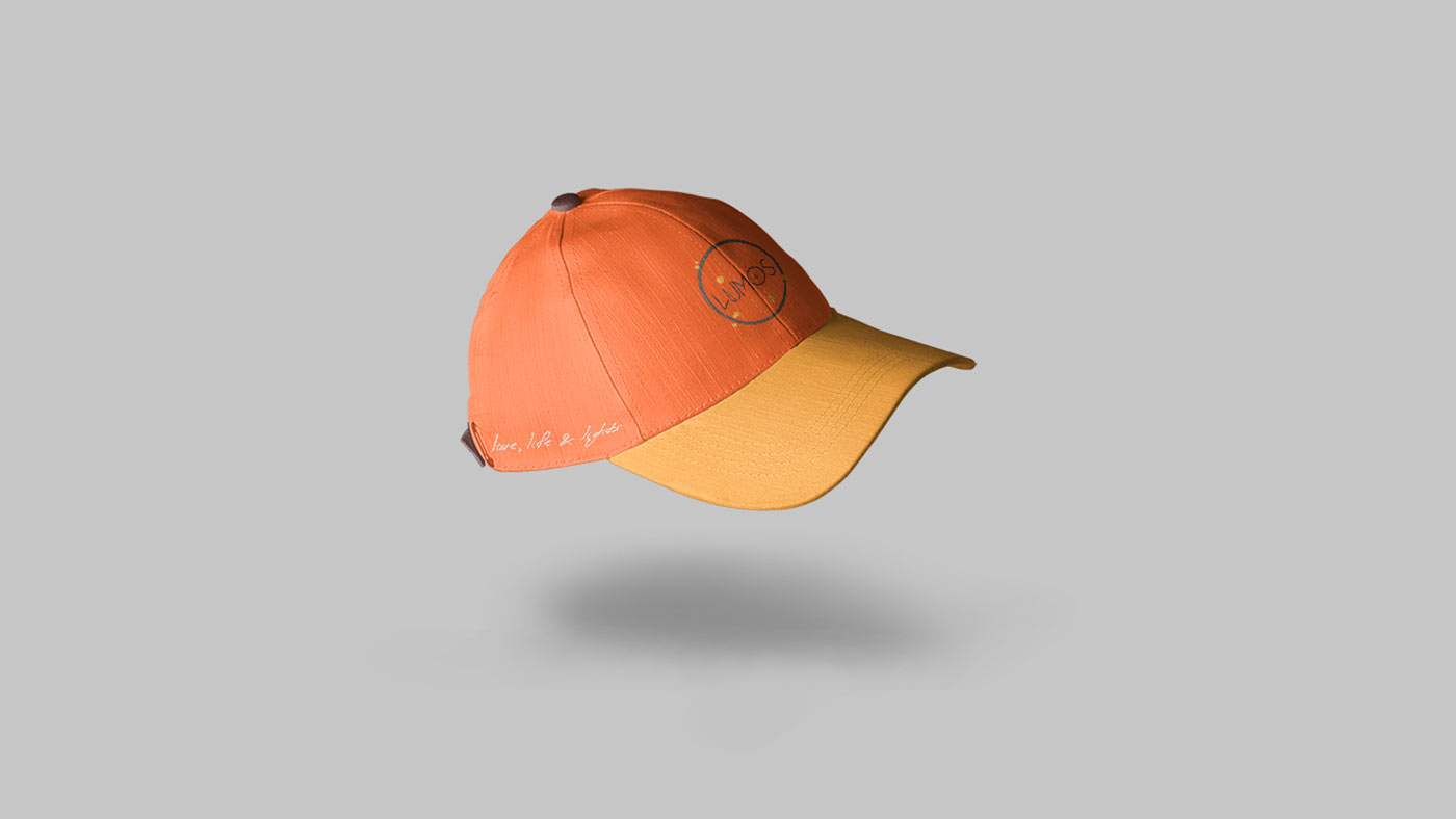
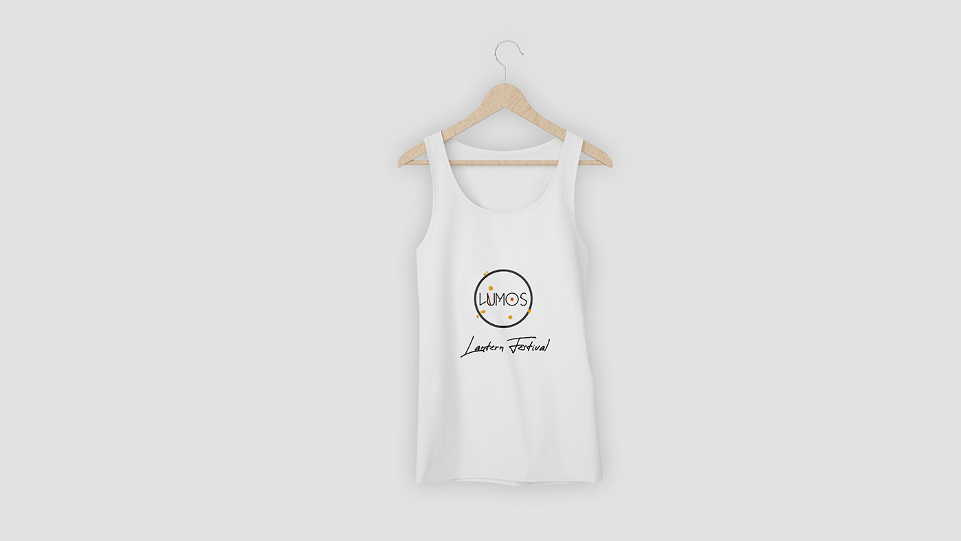
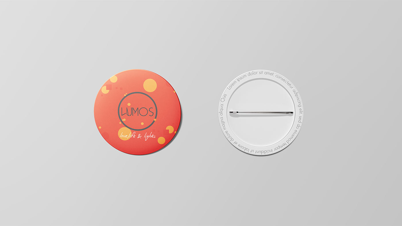
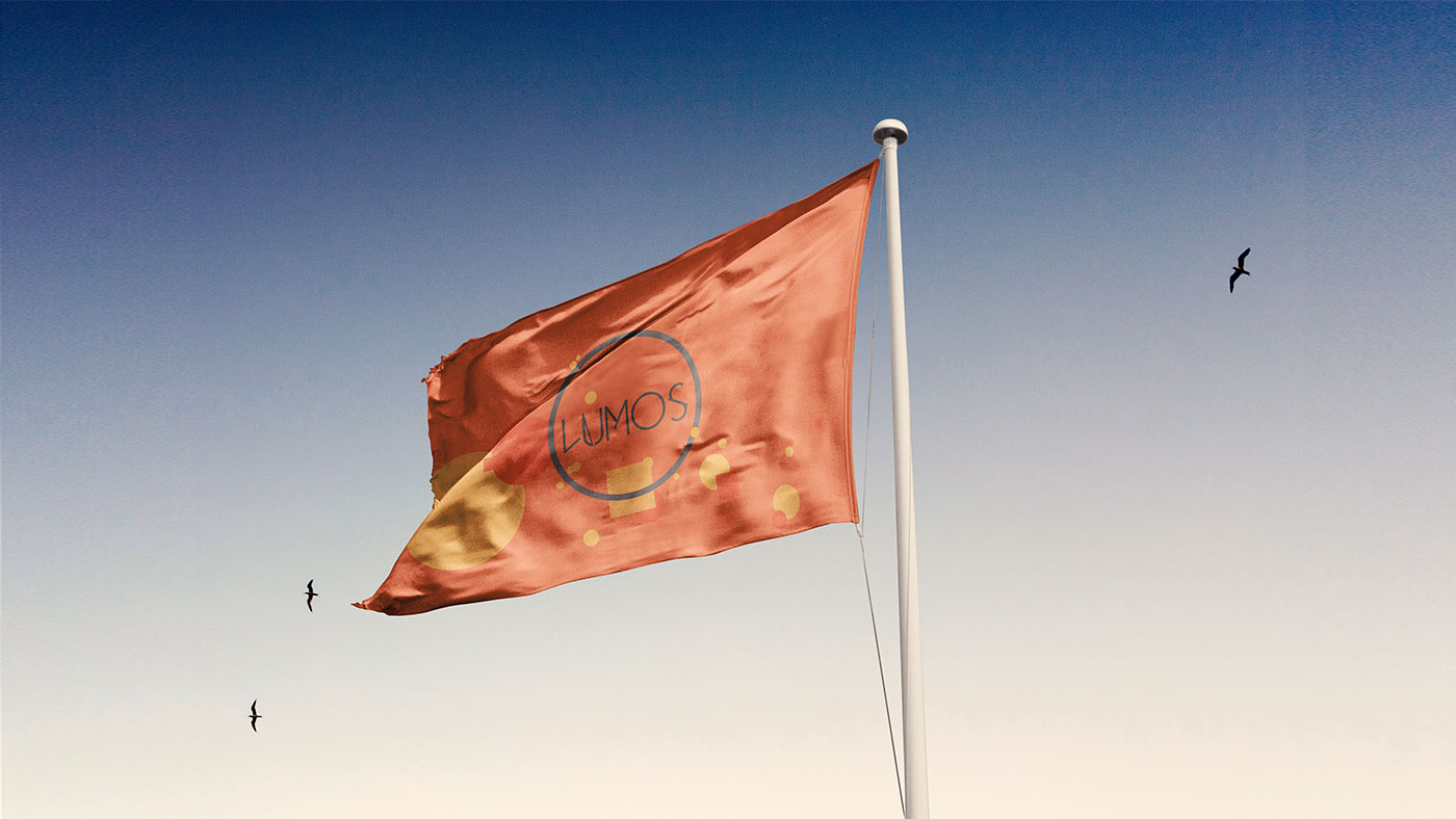
Brand Merchandise
In the end it could be said, Hey it’s just a Logo, a Business Card and a website like everyone has these days. But you know what the whole point is? It’s all about telling a story. Story that’s felt, story that stays with us, story that we tell others. And others tell some more others. After all thats the point right? You think this road works for you? Let's think together.
